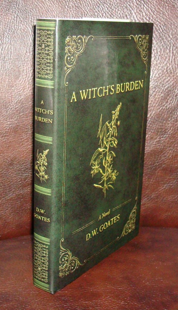
(4/17/19) It’s here! Look what UPS brought me yesterday afternoon. The proof looks great! I’m particularly impressed with the quality of the binding and paper. I think you’ll like the font I selected as well–Adobe’s update of the classic Jenson.
I took this picture to give you an idea of what the spine looks like, and was about to share some of the inside as well, but decided to wait on that for now. At the very least, a “look inside” sample from Chapter I will be available before it goes up for sale; in the meantime, I may augment this on my blog here for promotional reasons, so be sure to check back frequently.
It really is smart looking. I’m sure you’ll like it. And I haven’t forgotten that I owe you some further details regarding the cover design…